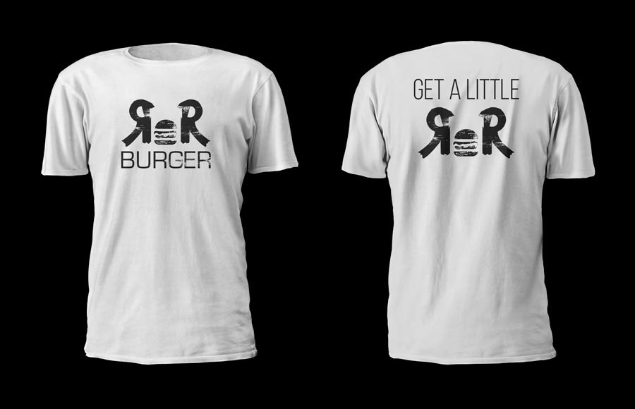
Rock N' Roll Burger
The new logo for Rock n Roll burger in Simi Valley.

Client supplied drawing of the proposed logo. (prepared prior to introduction)
Walking into this project it was clear that my client had a very distinct picture in his head about what he was looking for. He already had the sketch above all drawn and colored in. This however is a good sign, since I could ask him questions in depth and get very useful information from him. However he wanted me to explore different colors to see which might be better for the color scheme, as he intends to rebrand the business (previously known as rock and roll cafe).
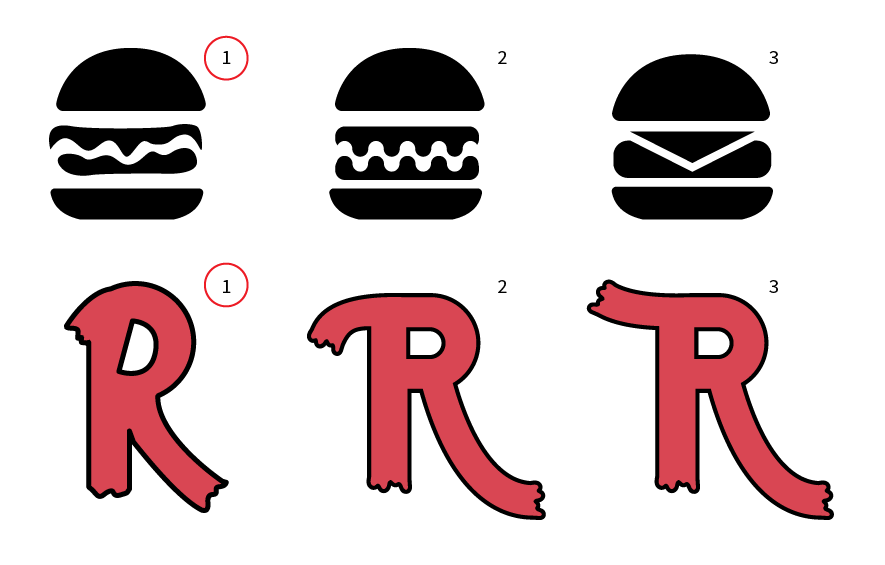
Above, numbers 1 in row one and 1 and row two were the chosen concepts of the examples given. These were basically drawn directly on top of the graphic he sent to me, with a little smoothing here or there. The other concepts were slight abstractions and typographic experiments.
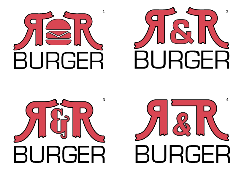
Due to the #1 options being chosen, these concepts were scrapped, although used to understand more deeply what my client was looking for. He really liked the placement and style of #1, but he wanted to try it with the original letter and burger graphics that were chosen. He didn't want to include the ampersand since he felt the burger better embodied the business.

Here are a couple more of the concepts that I pulled together, not necessarily to be published, but to flesh out ideas that could have shown merit. The bottom right graphic caught my client's eye due to the eroded effect, which he requested on a previous occasion. He wanted to see what the logo would look like in red and black without the box around "burger". Shortly afterwards he decided to make the burger a grey to accent the logo. Which ended up being the final product.
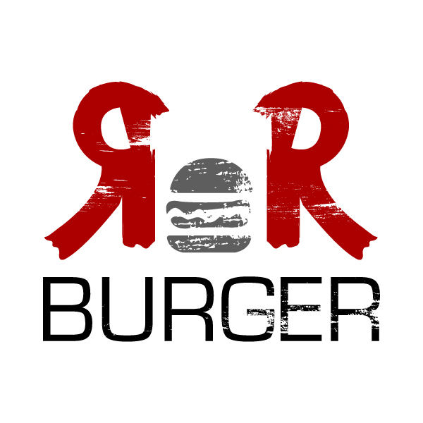
Final logo design. Supplied in 3 color, 2 color, and black & white solo color variants.