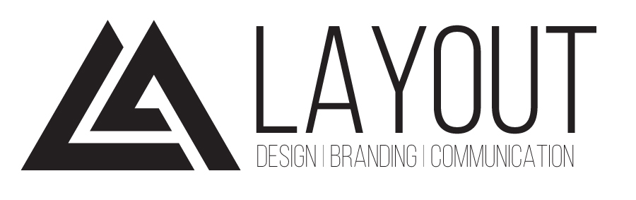
LAYOUT
This is a showcase of both my design process and the example of how I am developing my logo towards a more effective version. I include sketches, vector mock ups, and commentaty
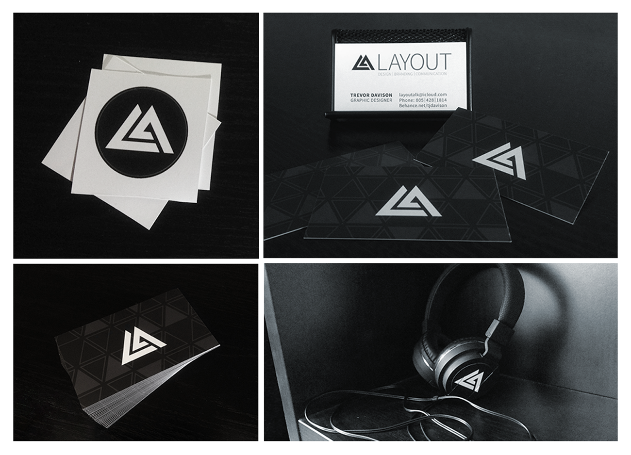
This logotype is the official logo for my personal graphic design business LAYOUT. The original design was simply a triangle with a wedge that pulls away. However, the logo was pushed further through the process seen below. You can find this logotype being used on my personal website layoutidentity.com as well as on my business cards, brochures, and stickers.
LAYOUT LOGOTYPE

Here is a showcase of my preliminary sketches, rendered in ballpoint pen. The sketches on the left are more cursory and are an example of an exploration of a broad area of ideas. The sketches on the right are targeted to explore the nuances and possible variations resulting from the original logo design which is rendered on the top left of the first section of sketches.
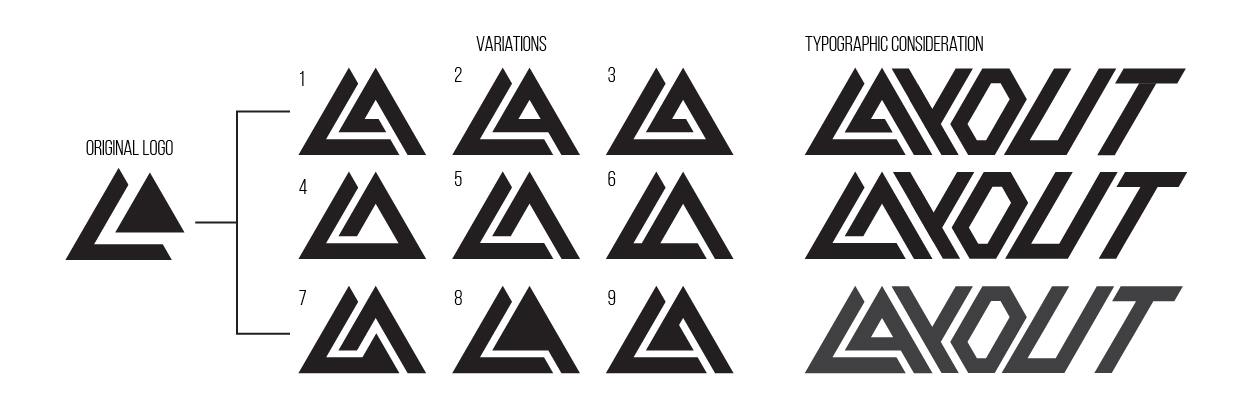
This is a showcase of some of the variants of my personal logotype. this is a digital comp of the sketched versions I have created in the past few days. Also, on the side I have devised a font using only 30º and 60º angles, as are created when rotating and utilizing triangles.The typographic considerations were merely a bit of play to see how I felt about making a matching typeface for the logo using similar principles. However I decided against the idea and I use Bebas Neue and Source Sans Pro as my official fonts for my brand.