Kerri Topham Paint Company
The full design process for the Kerri Topham Paint Company's logo.
Kerri Topham reached out to me regarding her business venture in Fort Lauderdale Florida. She was looking for a logo design and some other associated materials to be designed. Her business involves a small team of contractors for various applications of paint to commercial buildings/residential homes as well as some carpentry and lighting specialists.
I started off, as is the beginning of my logo design by gathering as much information as I could. Being given a full brief including the copy for her flyer, services they provide, and a loose guidance for logo instruction, I began to sketch up some concepts.
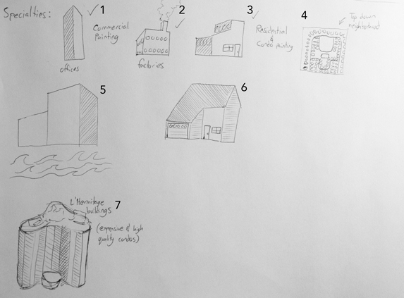
Using lateral sketching techniques, I detailed visual representations of the services being provided by the Kerri Topham Paint Company. As the lighting and carpentry work are the secondary services, I put them on the back burner and focused on the business' strengths, commercial painting. Using my sketches, I roughed out some vectors with various color applications and sent back what I had completed and waited to hear back from my client to see what her opinions were.
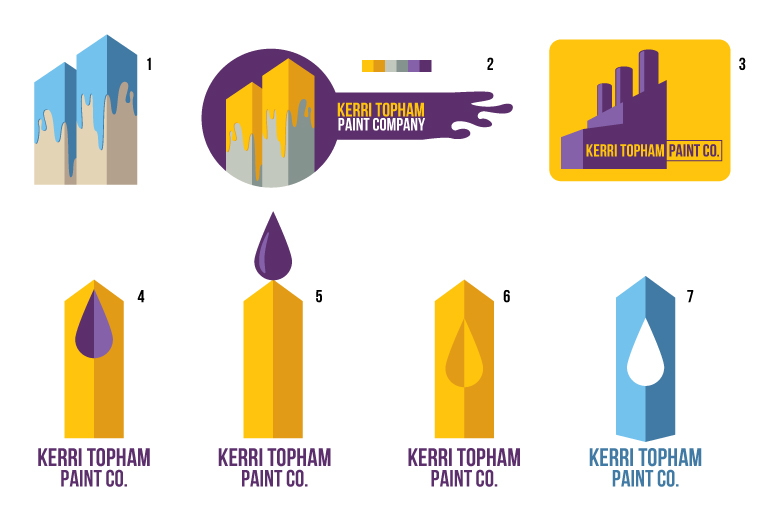
The initial vectors were simply quickly rendered graphics to illustrate a greater thought. I wanted to see which of these ideas might make my client more excited than the others. Of these sketches, I was fairly certain 1 or 7 might be the top options of the pack. However, my client liked the unique style of #2, particularly with the drippy extension, so then I hashed out some further designs to see which would work best.

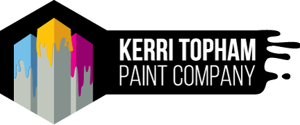
Based on some information from a colleague, I realized that there was an uncanny resemblance to the twin towers in the original #2 graphic. In order to distance my client from any unintentional messages, I advised that we move to either one or three buildings, presented with the graphics you can see above. She chose to work with the Option 1 graphics and told me that she liked the concept so much that she wanted me to prepare that graphic as the offical artwork. Due to the black and white versions' complexity, I spent time ensuring that the final graphic was transparent and sturdy, as many logos with complex shapes and clipping masks can result in poor recreations later on. My client was very satisfied with her logo design and her associated material.